
ToolTips 101: Creating Handy Hover Overlays in Figma
ToolTips 101: Creating Handy Hover Overlays in Figma
ToolTips 101: Creating Handy Hover Overlays in Figma
Ready to add a bit of flair to your designs? Explore how to whip up ToolTips - those handy pop-ups - when you hover over stuff in Figma.
Ready to add a bit of flair to your designs? Explore how to whip up ToolTips - those handy pop-ups - when you hover over stuff in Figma.
Ready to add a bit of flair to your designs? Explore how to whip up ToolTips - those handy pop-ups - when you hover over stuff in Figma.
Introduction:
Hey there, design enthusiast! Let's dive into the universe of hover overlays. You know, those little info bubbles that pop up when you hover? We’re going to learn how to make them in Figma – it's easier than you think!
Tutorial Preview:
Today's goal: creating simple and helpful tooltips that show up when you hover. Think of it as adding a dash of extra info to your designs.
Prerequisites: Got a design file handy? No stress if not, we've got this simple form template by Sonia to play with. And a ready tooltip frame. You can also use "ToolTips" plugin to create one - it's pretty handy! (Yup, a shameless plug!)
Step-by-Step Guide:
Let's get started: Images follow the text directly above them.
Set up your file. Have a tooltip frame chilling beside your design.
![[Image one - Tooltip Frame and Design Element]](https://framerusercontent.com/images/DoW3TstolOttasrJyKtbchVAQ.png)
Name it and keep it outside other frames for easy spotting. Smart move, right?
![[Image two - Tooltip Frame Placement]](https://framerusercontent.com/images/9K8ZiSMkzgf0oQazdlQbxIhOU.png)
Now, switch to Prototype Mode, pick your target layer, and let's add a little interaction.
![[Image three - Add Interaction]](https://framerusercontent.com/images/8ZNZZuci0lkdJMomF4wySmpVt9Q.png)
When you choose "While hovering," and set the action to "Open overlay," it’s like saying, "Hey, ToolTips, it's your time to rise and shine!"
![[Image four - Trigger and Action Selection]](https://framerusercontent.com/images/IT7ee8BkPfJ7rjl9cOvEeTCHoC4.png)
See that dropdown menu with None selected? Choose your tooltip frame there - remember the naming we did before..
![[Image five - Select Tooltip Frame]](https://framerusercontent.com/images/WlU04bvdDrkTgKENSGSjQ6iuDDc.png)
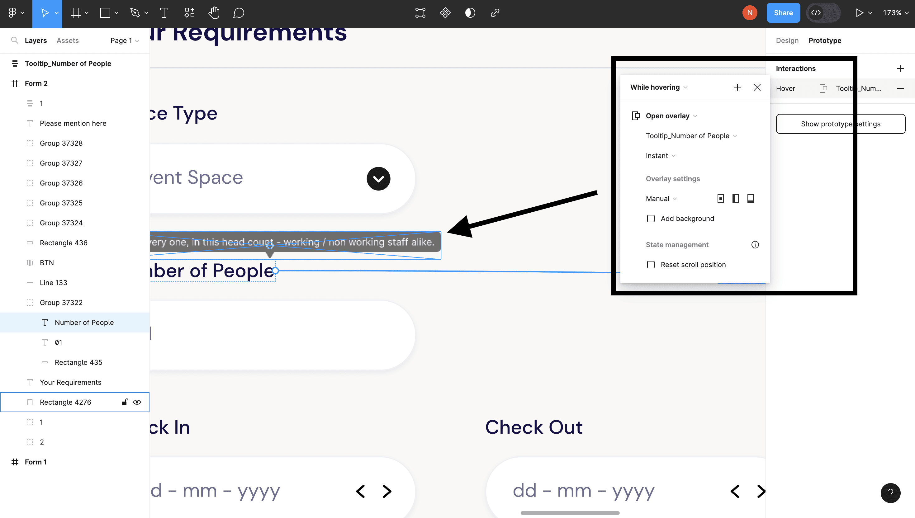
Time to spruce things up. Set the animation, keep it "Instant" or play with "Dissolve." And do this the last part – set position manual in this dropdown, once done a false copy of tooltip appears near the target layer - it is the anticipated position of your tooltip when you hover over the target - place it as you like.
Tooltip done! now ready to try? Test it out in the prototype view. Let’s see if those ToolTips are feeling as helpful as they should!
There you go! Hover overlays are like those little helpful hints you want in your design journey. By tweaking Figma's tools, you’re all set to create designs that are interactive and super engaging.
Thanks for Reading!
Introduction:
Hey there, design enthusiast! Let's dive into the universe of hover overlays. You know, those little info bubbles that pop up when you hover? We’re going to learn how to make them in Figma – it's easier than you think!
Tutorial Preview:
Today's goal: creating simple and helpful tooltips that show up when you hover. Think of it as adding a dash of extra info to your designs.
Prerequisites: Got a design file handy? No stress if not, we've got this simple form template by Sonia to play with. And a ready tooltip frame. You can also use "ToolTips" plugin to create one - it's pretty handy! (Yup, a shameless plug!)
Step-by-Step Guide:
Let's get started: Images follow the text directly above them.
Set up your file. Have a tooltip frame chilling beside your design.
Name it and keep it outside other frames for easy spotting. Smart move, right?
Now, switch to Prototype Mode, pick your target layer, and let's add a little interaction.
When you choose "While hovering," and set the action to "Open overlay," it’s like saying, "Hey, ToolTips, it's your time to rise and shine!"
See that dropdown menu with None selected? Choose your tooltip frame there - remember the naming we did before..
Time to spruce things up. Set the animation, keep it "Instant" or play with "Dissolve." And do this the last part – set position manual in this dropdown, once done a false copy of tooltip appears near the target layer - it is the anticipated position of your tooltip when you hover over the target - place it as you like.
Tooltip done! now ready to try? Test it out in the prototype view. Let’s see if those ToolTips are feeling as helpful as they should!
There you go! Hover overlays are like those little helpful hints you want in your design journey. By tweaking Figma's tools, you’re all set to create designs that are interactive and super engaging.
Thanks for Reading!
Hit me up for Work Opportunities or Collaborations.
Time to shatter that ice! Say hi and break the chill!
© Nishad Patne | 2024
Hit me up for Work Opportunities or Collaborations.
Time to shatter that ice! Say hi and break the chill!
© Nishad Patne | 2024