iSTART Early Mobile Application
Challenge
The primary challenge was to transition a robust educational tool from desktop to mobile, catering to children as young as grades 3 to 5.
This adaptation required a change in platform and a complete reimagining of how educational content is presented and interacted with on smaller screens.
Project Type
Mobile Application Design
Tech stack
Figma, Pen-Paper, Dall-E, ChatGpt, Photoshop
My Role
UX and UI Designer
Stakeholder / Client
Personal Project, SoLET Lab, ASU
Process- Overview
Consider these as sections where I present my work, not in chronological order. I've moved back and forth at each step, iterating for improvement.
1
Research & Discovery
Explored learning science, mobile app impacts, and pedagogy. Emphasized empathy for students, parents, and teachers via research.
2
Definition & Ideation
Used desktop app insights to craft mobile features, AI integration, user flows, and UI sketches.
3
UI Design & Prototyping
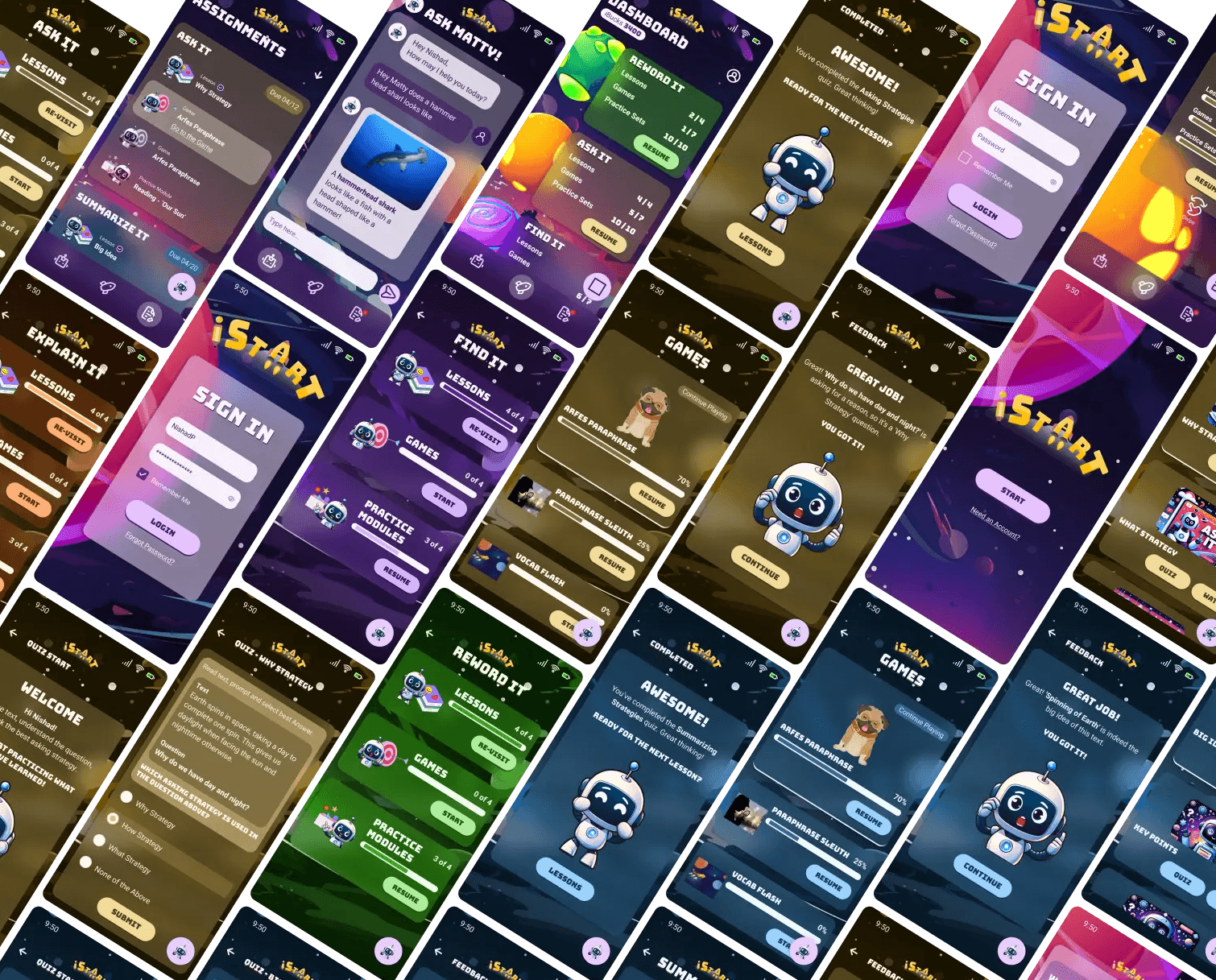
Studied UI trends, adapted desktop style guides for mobile, created layouts and micro-interactions, acquired graphics assets to complete the prototype.
4
Conclusion & Future Directions
Focused on essential research and UI and UX design learnings. The UI undergoes internal testing at LEI, with user testing next.
Research and Discovery
Introduction
The iSTART* Early intelligent tutoring system, developed by the Science of Learning and Educational Technology (SoLET) Lab at Arizona State University, builds on extensive interdisciplinary research integrating psychology, linguistics, and computer science.
Directed by Danielle S. McNamara, the SoLET Lab specializes in creating advanced educational technologies, including game-based tutoring systems that enhance learning and comprehension for diverse student populations.
*Interactive Strategy Training for Active Reading and Thinking (iSTART)
Peer-reviewed research papers, 3 books spanning over 2 decades.
Where do I come in?
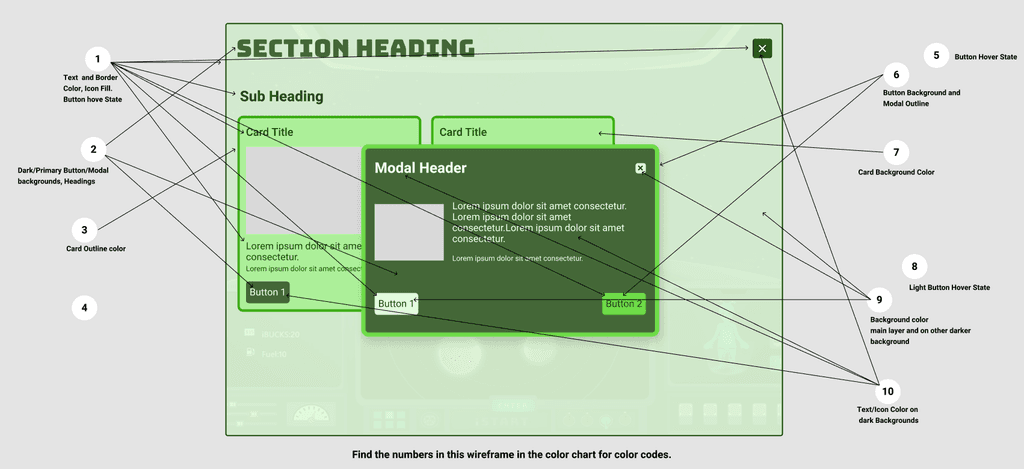
I started with the lab as a Product Designer (Specialist). I contributed (and still do) to iSTART Early by creating a color and brand guide, UI for desktop screens, educational games on Storyline 360, and CSS/SCSS themes.
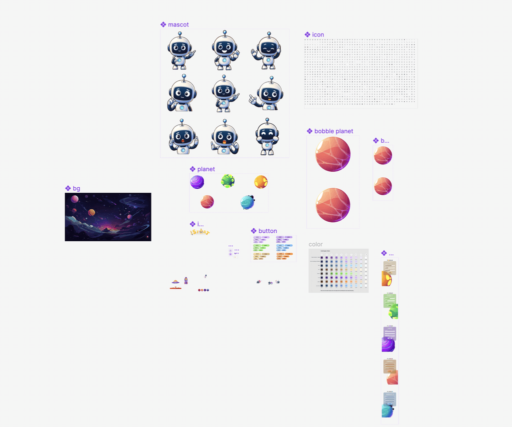
The right side images show a color scheme for the main theme and planet-specific theme with an example model for implementation.
Why a Mobile app when a desktop version exists?
My work in Ed-tech, inspired by research including J. Breitwieser et al., motivated the creation of the iSTART Early mobile app.
The addition to mobile platforms leverages:
Home Learning: Transforms educational tasks into engaging home activities.
Parental Monitoring: Simplifies how parents track progress.
Wider Reach: Expands access globally, even in areas with limited tech infrastructure.
"Mobile devices like smartphones and smartwatches are ubiquitous both inside and outside the classroom, but their potential for personalized education has yet to be realized."
Breitwieser, Jasmin & Neubauer, Andreas & Schmiedek, Florian & Brod, Garvin. (2023). Mobile Interventions: An Untapped Potential for Education.
Additions to iSTART Early
Adapting the desktop app to a mobile interface was challenging, but integrating AI through our pedagogical agent, Matty, truly enhanced the project:
Pedagogical Agent - Matty: Positioned as the central feature, Matty brings a conversational AI experience to the forefront.
AI Integration: This allows Matty to act more like a companion than a mere tool, significantly enhancing user interaction.
Feedback from my team—developers, product owners, and researchers—was crucial, driving iterative improvements and aligning the app with our educational objectives.
Definition and Ideation
What is included?- Features
With constant research on the concept of application in motion, I began listing and finalizing the features I planned to include in this project.
Features that I subsequently finalized to be put in application are:
Learning Management System (Student's View) :
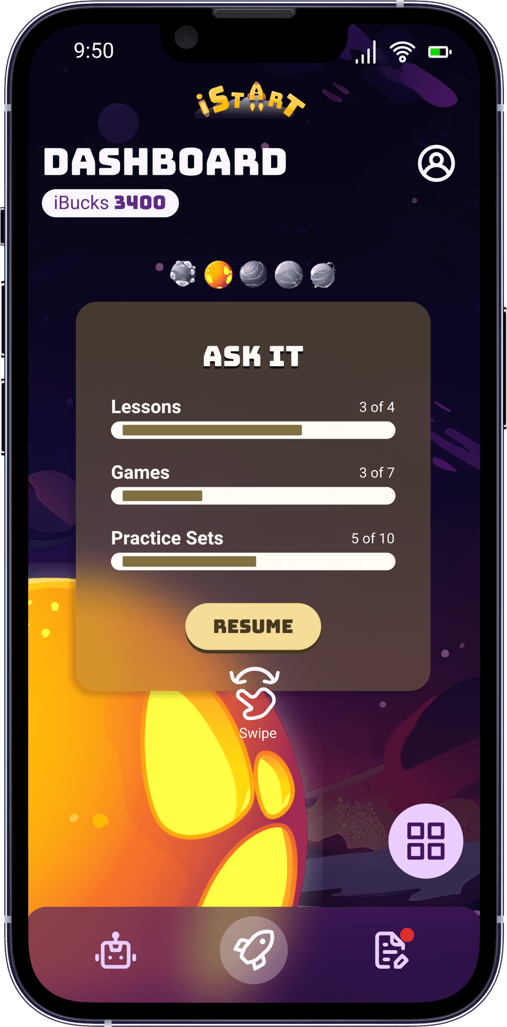
Overview dashboards.
Strategies depicted as planets, planet specific dashboards with unique themes.
Quiz UI.
Assignment Screen.
Matty's Chat Interface - A standalone chat interface and a floating pop up for contextual questions.
Utility Features - Login, Intro and communications screens.
User Flow and Flowchart
With features finalized, I created this flowchart to visualize the user flow.
Low Fidelity Sketches
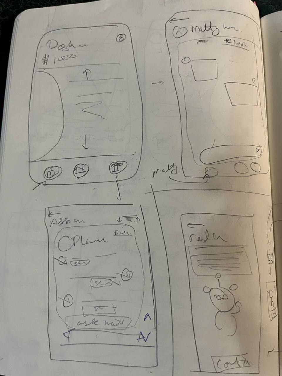
I utilized low-fidelity sketches to effectively validate and visualize various aspects of the application before advancing to detailed UI design:
Application Layout & UI Patterns: Ensured the design's practicality and aesthetic appeal.
Microinteractions & Feasibility: Assessed from a development perspective to guarantee smooth implementation.
Efficient Planning: These wireframes facilitated a rapid enumeration of necessary UI components, graphic assets, and design specifications."
UI Design and Protoype
Design Research
In developing the iSTART-Early mobile app, I incorporated a space-themed design and leveraged AI technology:
Space-Themed UI Design: The application utilizes a captivating space theme that resonates with young users. This theme is designed to spark curiosity and inspire a sense of adventure, making the learning process both enjoyable and immersive.
AI-Driven Interactivity: Featuring Matty, our AI pedagogical agent, the app personalizes the learning experience through conversational AI. This adaptation allows the app to serve as more than just an educational tool—it becomes a companion that engages and grows with the learner.
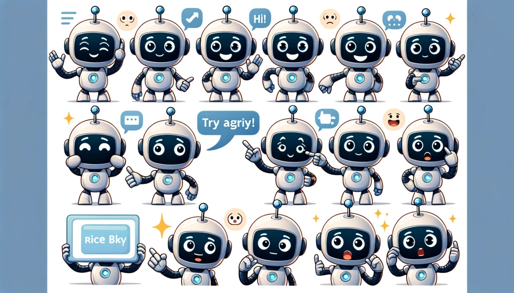
Graphic Asset Creation with AI: AI tools such as DALL-E were instrumental in creating unique, space-themed graphic assets efficiently, specifically our mascot MATTY. These visuals are seamlessly integrated into the app, enhancing both its functionality and appeal.
UI Design
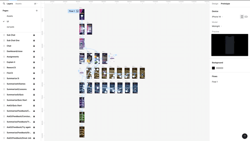
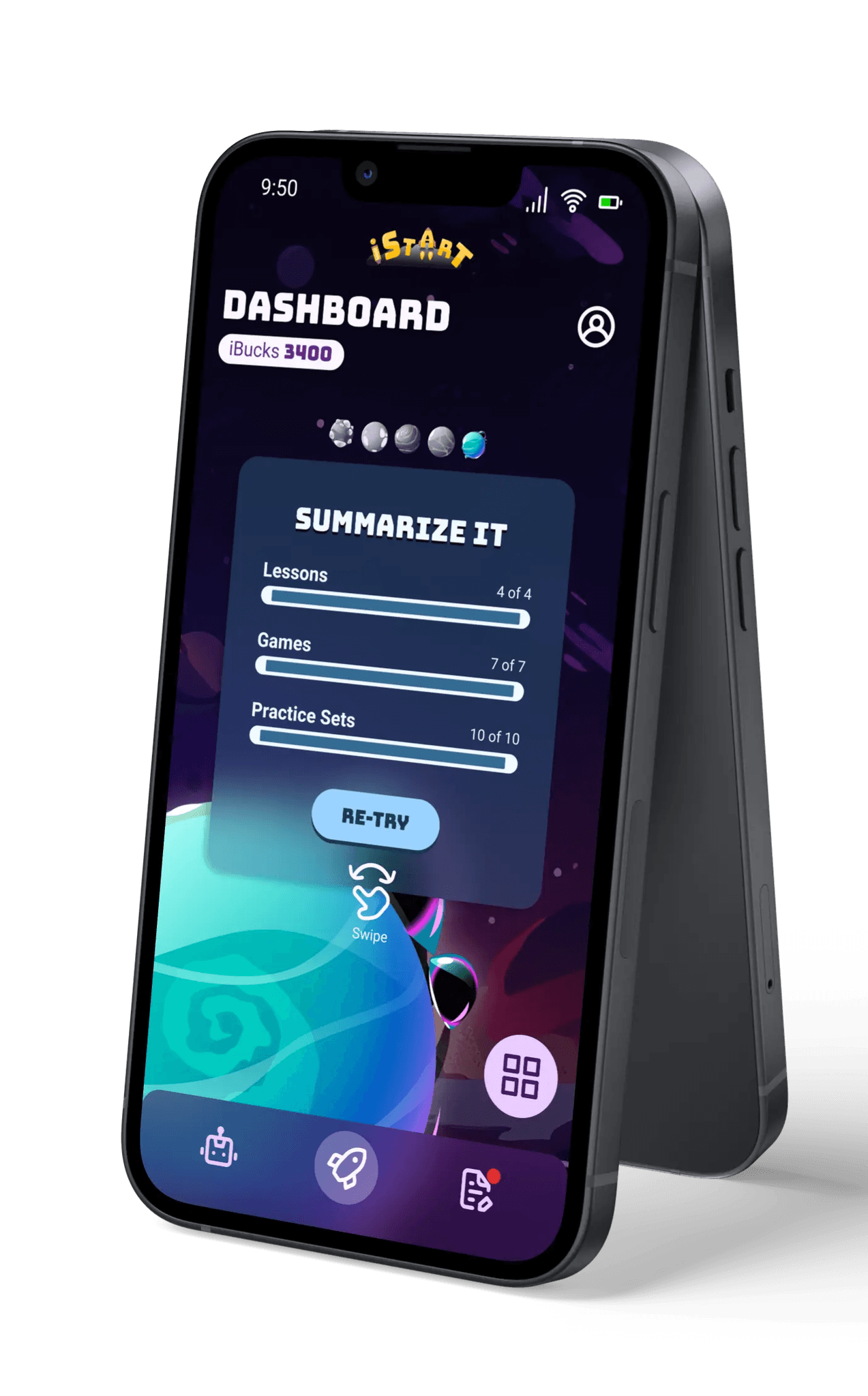
After conducting thorough research on the concept, functionality, and user experience design, I was ready to begin the UI design. Although my approach involved multiple iterations, I will present the final stills from the Figma file without delving into the entire iterative process.
Prototype
No more stories. Here is the final Prototype!
Conclusion and Next Steps
Prototype and Future Directions:
With the first phase of prototype complete, I next want to concentrate on the extended features in profile management, incentive structure, games and lesson delivery and much more as I brainstorm with the team.
Reflection:
Designing the iSTART-Early mobile app was a multifaceted challenge that blended creativity, technology, and pedagogy. As a UX designer, wearing multiple hats—from researcher to artist—was not only necessary but also deeply rewarding.
Looking Ahead - Research:
The excitement builds as I wish to introduce this mobile tutor to students and conduct a focus group study along with other studies in Usability and learnability. This project was more than just a design task; it was about creating an accessible, engaging learning companion that brings educational adventures right into the hands of eager learners.
Credits where due!
For some of the graphics and characters I used in this project, I owe a huge thanks to these people and platforms:
Tong Lee, former product specialist (not the exact title) at SoLET Lab.
VectEasy
Freepik

