Paani Foundation
Challenge
The Paani Foundation's desktop website UX requires enhancement. Issues include a complex navigation system, incongruent link placement, obscured contact information, design inconsistencies, and flawed form validation. Targeted research aims to refine navigation, design, content layout, and form interactions, aligning user expectations with the foundation's mission for greater digital outreach and impact.
Project Type
UX Research and Recommendations
Tech stack
Figma, Balsamiq, Zoom, Google Suite
My Role
UX Researcher and Designer
Stakeholder / Client
ASU, Paani Foundations
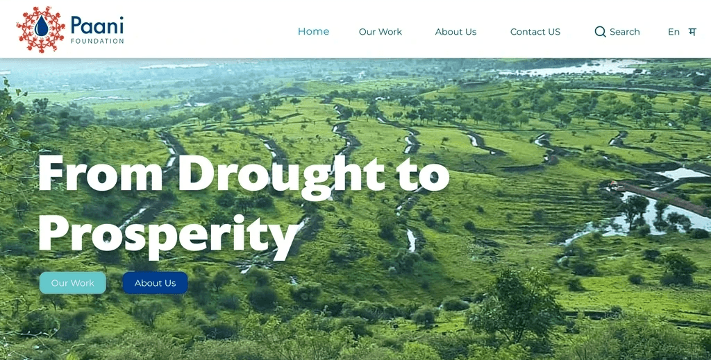
Paani Foundation is a dedicated NGO in Maharashtra, India, that supports farmers and marginalized communities grappling with recurrent droughts and water scarcity. Their mission involves educating and empowering these groups through water conservation, sustainable practices, and environmental awareness. Combining knowledge, training, and financial aid, the foundation aims to drive positive change amid challenges.
Focusing on the organization's desktop website, user research aims to enhance UX and usability. The study addresses latent usability issues, aligns user expectations, refines navigation, improves design, simplifies content, and optimizes form interactions. These insights intend to transform the online interface into a user-friendly tool, expanding outreach, engagement, and impact.
Executive Summary
Nature Of Testing
Heuristic Evaluation
Survey-Based User Research (19 responses recorded)
Scenario Based Usability Testing (tested with 5 representative users, focusing on 3 scenarios).
Key Findings - Major Issues
Website Navigation
Content Hierarchy and Organization
Contact Us Section
Recommendations
An improved 3-level Navigation System.
Dedicated Activities/Works Page.
Enhanced Contact Us Page with improved form validations.
Reasons for Recommendations
Addresses the prominently highlighted issues in usability testing and research.
Issues are feasible to prototype and test.
Impacts a large portion of the website.
Enhances the Site in accordance to Nielsen's Heuristics.
Let's explore the Case Study's Whats, Whys, and Hows. If you're short on time, jump straight to the later sections.
Click to Scroll - Ideation and Recommendation Sections
Discovery Phase
Heuristic Evaluation
Why was it done?
Preliminary analysis to discover and articulate usability issues and establish a severity scale.
What was achieved?
8 of 20 issues across various severity levels were validated by users in subsequent user research and usability test.
5 of the issues thus identified have been addressed in the final recommendations.
User Research
Why was it done?
To collect demographic and psychographic user data and understand user goals, motivations, and frustrations with the website.
What was achieved?
3 distinct kinds of Personas were identified, with the majority of respondents belonging to the Indian IT Industry with specific goals, motivations, and frustrations.
Personas (with research data and a general understanding of the website) were used to create User Stories and Acceptance Criteria.
Define Phase
Personas
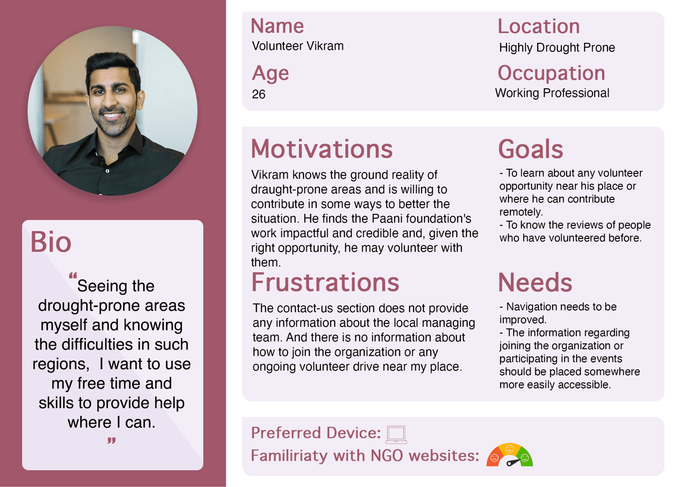
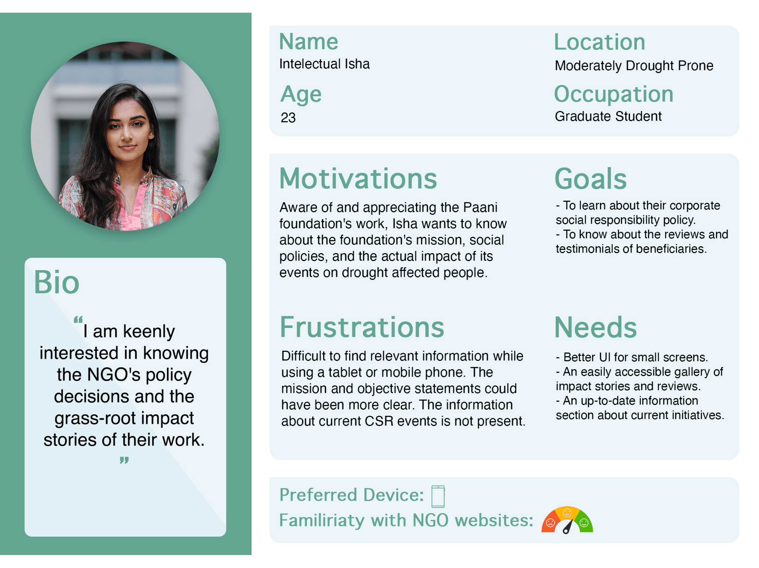
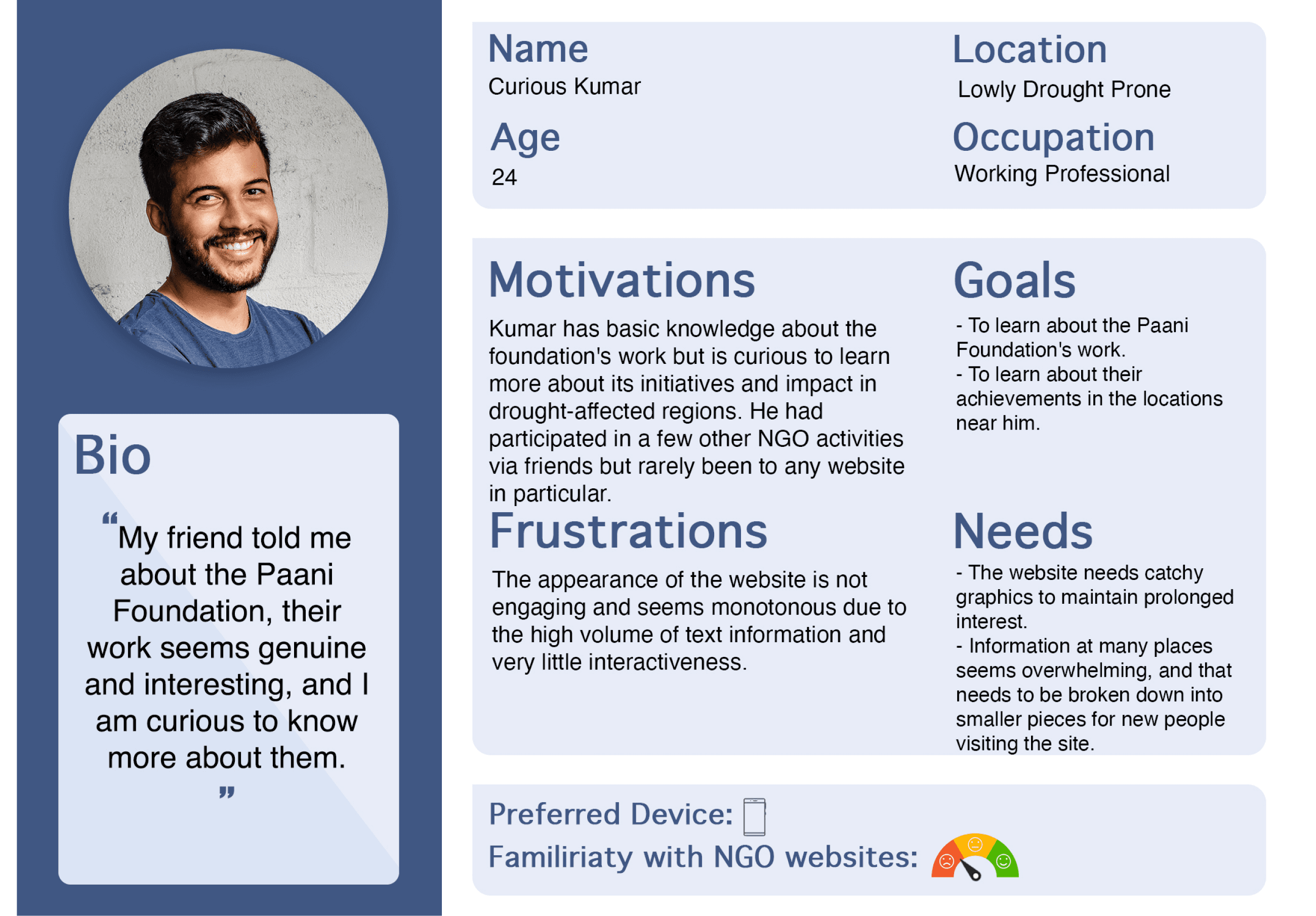
Data from 19 user entries shaped 3 Personas, guiding subsequent User Stories and Usability Tests for clear user group representation.
3 Personas
Potential Volunteer
Policy Auditor
New User
User Stories
Based on User Research Data and Personas 11 user stories were created with appropriate acceptance criteria for each.
Personas helped categorize user stories by goals, forming the foundation for scenario creation in usability testing. One/two user story from each persona was selected to cover various aspects of the website, user goals, and validate heuristic evaluation findings.
Usability Testing Phase
Why was it necessary?
Test and validate usability issues, analyze user mental model, study interaction patterns, and review positive/negative feedback.
How was the testing material created?
By selecting one user story from each persona, the scenarios were created to cover most of the website, and user goals and try to validate the issues identified in heuristic evaluation.
The tasks were intentionally left open-ended to let users explore the website and understand their interaction patterns.
Post-test interview was conducted to get immediate user feedback, frustrations, and suggestions. Also, the user’s perception of the importance of tasks was asked, which helped to again identify user needs.
What was achieved?
Validated known issues, uncovered new ones, improved user interaction understanding, and assessed issue severity and priority using task completion time, user comments, and success/failure rates.
Results and Findings
Quantitative Findings
11
prominent issues were discovered
9
Tasks in 3 scenarios were tested
80%
Success Rate
Qualitative Findings and Inferences - 10 Most Important
User Expectations & Navigation: Mismatch with site structure and information.
Click Behavior: Users often clicked the first link, even if irrelevant.
Inconsistent Information: Across showcased foundation activities.
Footer Neglect: Little attention paid to the footer.
"Contact Us" Struggle: Difficulty finding it, expected in top right corner.
Volunteer Engagement: Desire for clearer connection options.
Email Subscription: Lacked proper validation, email ID formatting issues.
UI & Image Praise: Positive feedback on UI and images.
Video Overload: Excessive YouTube video links in impact stories.
Accessibility Concerns: Missing alt text and titles on site images.
Impact of Research Findings on Recommendations
The website's user interface is nearly flawless, with participants praising its color scheme, typefaces, layout, and graphics. However, significant rework is needed for the current user experience, particularly in navigation and information architecture. Key issues include difficulty in navigating due to a lack of content hierarchy, overwhelming users with choices.
Users express the desire to connect with the foundation and learn about those impacted by its work, yet the footer placement of vital links like Press Articles, CSR Policies, and the Contact Us section, along with the absence of direct connection options, adversely affects the user experience. These issues have been prioritized for prototyping and immediate improvement based on study findings.
Ideation Phase
Initial Wireframes
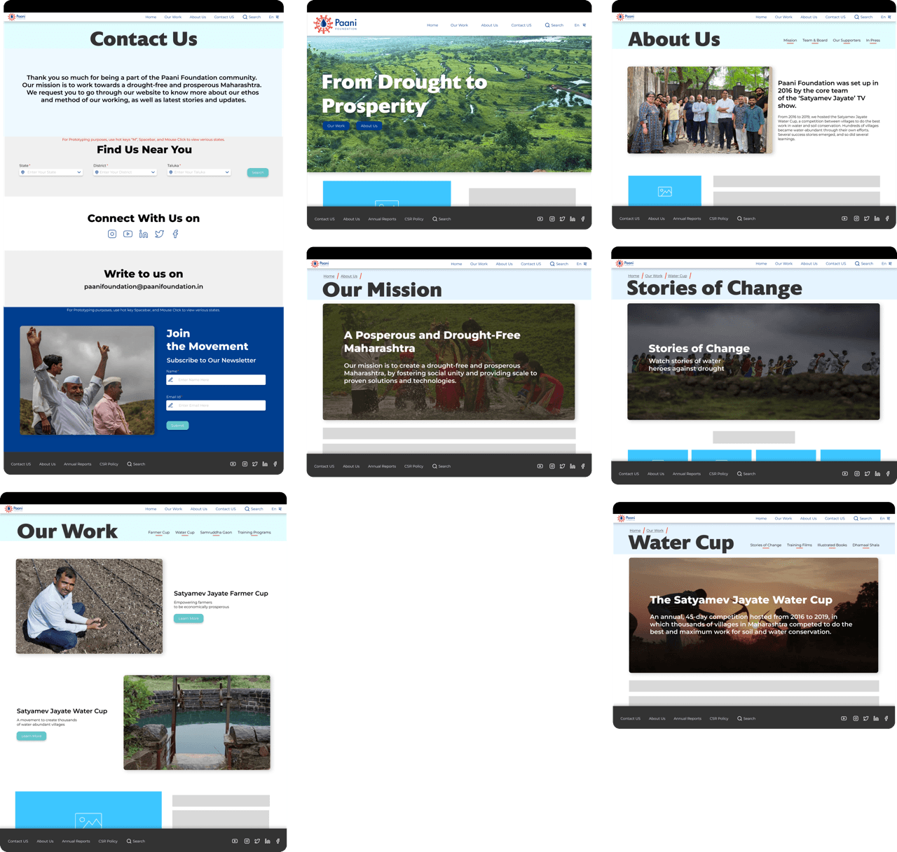
Screen Mockups
Recommendations
1. Website Navigations
Current Design
Proposed Solution
Issues:
1. Single Navigation System causing confusion.
2. User overwhelmed by sub-menu choices.
3. "Contact Us" & "In Press" links in footer mismatch user expectation.
Solution:
1. Implement 3-level Navigation System.
2. Primary global navigation aligned with user expectations.
3. Replace submenus with contextual secondary navigation.
4. Introduce breadcrumbs as tertiary navigation and position indicator.
Justification:
1. 5 out of 11 issues stem from faulty Navigation System.
2. Defies User Control and Freedom Heuristic, Level 2 severity.
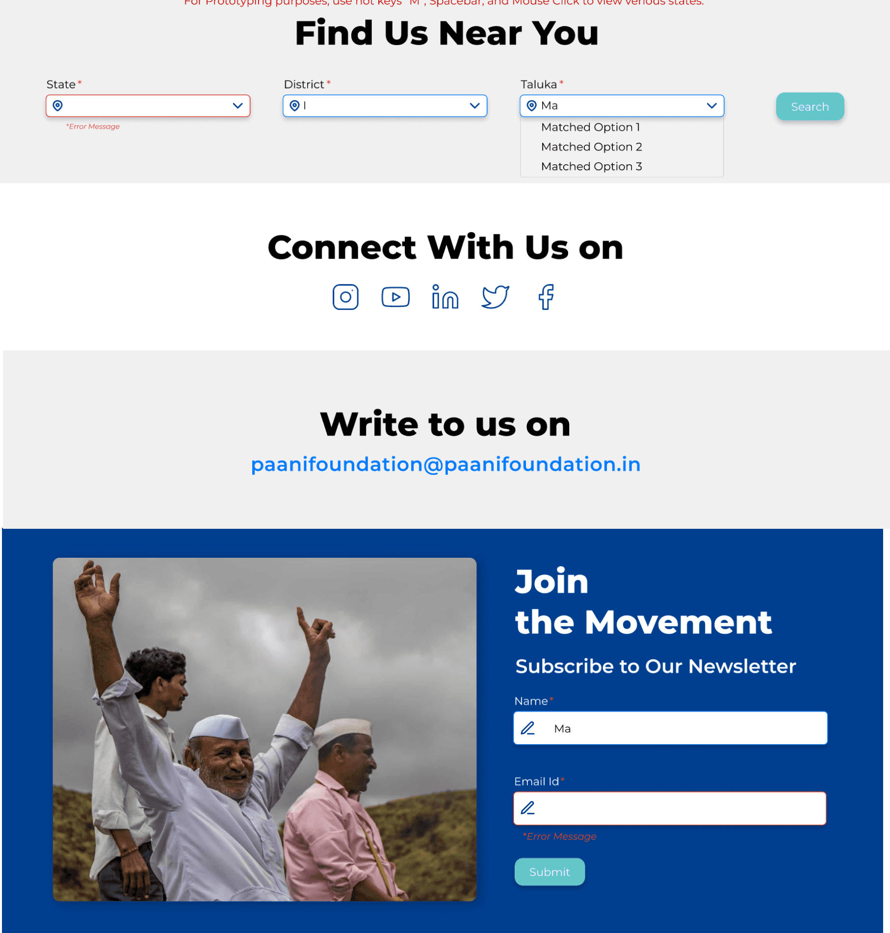
2. ‘Contact Us’ Section
Current Design
Proposed Solution
Issues:
1. "Contact Us" link in the footer.
2. Email ID lacks visibility.
3. Static Social Media Icons on hover.
4. Users want a more direct foundation connection.
5. Flawed validation in the "Sign Up for Email Updates" form.
Solution:
1. Move the "Contact Us" link to global navigation.
2. Add location-based contact search.
3. Increase Email ID and Social Media icon visibility, enhance hover effect.
4. Revise form validation with comprehensive checks and industry-standard error display.
Justification:
1. Users anticipate a prominent Contact section.
2. User research emphasizes direct contact.
3. Hover states enhance user feedback.
4. Robust validations align with Nielsen's Heuristics for error handling.
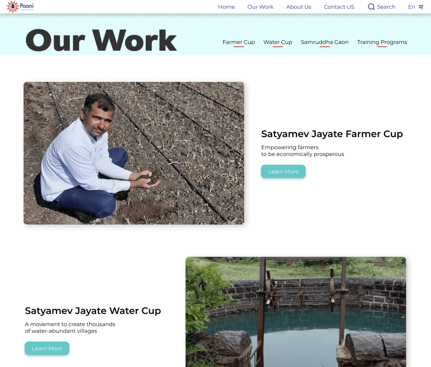
3. ‘Our Work’ Section
Current Design
Proposed Solution
Issues:
1. Individual activities in the Navigation Bar don't represent the foundation's overall work.
2. Users tend to click the first option, like the water cup icon.
Solution:
1. Replace existing activities with the "Our Work" link.
2. "Our Work" link leads to a new page with secondary navigation for all activities.
3. The page concisely describes activities with images and "Learn More" buttons.
Justification:
1. Centralizing activities reduces user time to find and explore details.
2. Multiple navigation options (links and buttons) enhance website flexibility and efficiency (Nielsen's Heuristic).
Conclusion
The user experience process is self-validating and evolves over stages. As I progressed through the research stages, the most prominent issues became evident. The usability test phase was particularly intriguing, as I had to figure out how to frame questions that guide the user without revealing too much. Since a few tasks were open-ended or lacked clear end states, it was challenging for both me and the user to conclude the tasks.
The final usability test results provided me with specific insights, highlighting both salient and non-salient aspects. This overall research and recommendation process taught me a lot about the initial phase involving heuristic evaluation and surveys, the definition phase with personas and user stories, and how they all culminate in the usability and prototype testing phase, fostering a deep appreciation for the iterative nature of the process.
Explore Further or Interact with the Prototype
Here are links
